

PandoraBio is an early stage startup that empowers college students to manage their mental health journey by detecting early symptoms and guiding them to personalized campus resources. At this stage, Pandora needed to distinguish themselves among competitors, raise capital, and appeal to the student market.
My role: Product Designer (creative director, UX, UI, illustration, graphic design). I worked on the branding strategy, performed user research, and developed the web design.
Time frame: Ongoing, website designed in 1 week

BRANDING STRATEGY

I worked with the three co-founders to distill and define the core ideas behind their product and company. They provided me a brainstormed list of words and phrases that they are drawn to - I screened this list for overarching themes and discovered 4 main categories of ideas. I then organized these ideas into adjectives that clearly described PandoraBio’s identity, and used these foundational themes to further develop the messaging on the website.
USER RESEARCH

FINDINGS: Students find this current color scheme calm, “environmental”, and cozy. They noted the colors are kind of dusty, and that they could be a little brighter. They mentioned purple was an exciting and energizing color that they like to see.

MARKET RESEARCH: I wanted to understand what people in the 18-22 years old age group are aesthetically and conceptually drawn to:

FINDINGS: This user group values authenticity, and value driven messaging that prioritizes social and environmental awareness. They want human connection, fun, and adventure, while keeping interactions casual and real. They’re drawn to bright, saturated colors.
STUDENT EXERCISE: I asked the students to share images that reminded them of hope and uplifting energy, and this is what they came back with. I noticed that these images all had a similar blue/grey background with warm yellow/orange highlights.


INTERVIEWS: I interviewed some of the student ambassadors that work for PandoraBio to see how they reacted to PandoraBio’s previous color scheme and UI:
WEB DESIGN


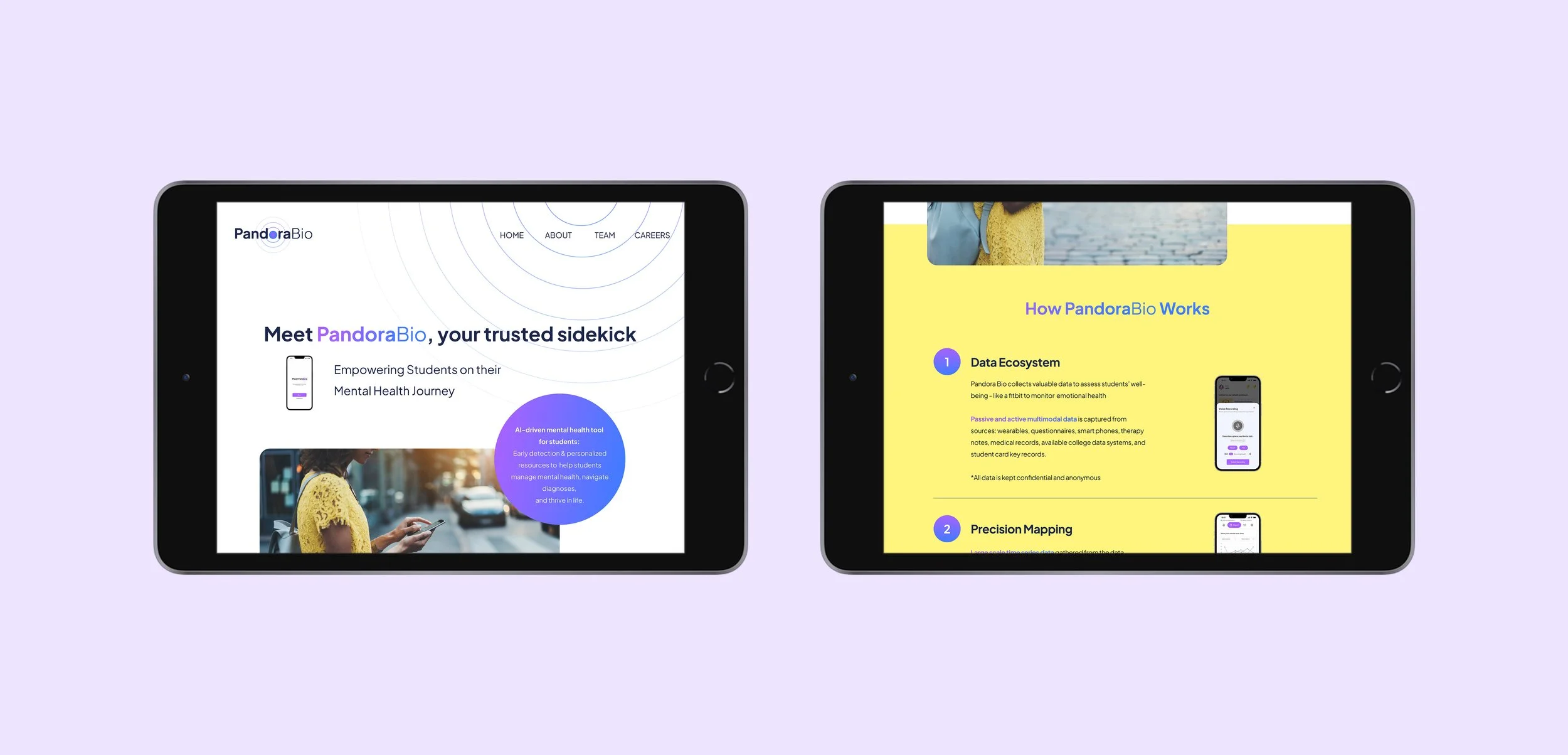
Incorporating the user research and branding strategy, I selected a set of colors that reflected Pandora’s core principles and messaging, while also considering student feedback & user group preference. The bright yellow signifies hope and optimism, while the energizing purple speaks to student autonomy/empowerment.
WIREFRAMES
i created low fidelity mock-ups for the web design, and iterated on this based on feedback provided by team members


COLOR PALLETTE & UI
Organized web design elements into a list of assets, for efficient coordination with developer

USER INTERFACE
The UI is thoughtfully designed by incorporating usability heuristics & gestalt principles, while responding to business & user goals

Business & User Goals
Reinforce brand identity (using tagline, photo selection, messaging, color scheme, and founding principles under “Why Pandora” section)
Appeal to students, parents, and admin (using color scheme, graphics, messaging, social proof)
Establish trust (using social proof at bottom of page)
Clearly state problem that is being solved, and how the product works (“How Pandora Works” section)
ATOMIC DESIGN SYSTEM